The Value of Design & UI/UX
Summary
- At this point, you understand and can articulate the value that the product management function provides to your company.
- While design and UI/UX can stand on their own within an organization, they are typically situated within Product Management alongside User Research due to the close collaboration required.
- Note that design and UI/UX can often be different individuals all the way up to different teams depending on the size of your organization.
- Design’s primary objective is to ensure that the solutions that the product team identifies as needing to be built are created in such a way so that they are readily accessible to the relevant customer personas.
- Pay Now or Pay Later - Good design reduces downstream costs by minimizing eventual customer support requirements, product documentation and customer churn.
Detailed Discussion
Let’s first better define the objectives of design:
- Accessible Solution Definition - A solution can be defined as accessible if it enables the user to obtain their desired solution at the lowest cost.
- Costs include:
- The time it takes for the user to learn how to obtain their desired result
- Additional financial burdens (data packages, add ons)
- Pre-work the user must undertake (properly formatting data)
- User mental memory usage and management (remembering data or inputs from one location to the next)
- Time/work necessary to recover from user errors (form data being lost and not being autosaved)
- Time required to reach out to support or read product documentation
- More colloquially, an accessible solution is one where the user doesn’t have to read the manual to obtain value. These solutions or products “just work", are a pleasure to interact with and use, and make the user feel great about the experience.
- it is important to note that a user’s willingness to invest time/energy/resources into your product does not have a linear relationship with how well it is designed, it is typically exponential in nature.
- For instance, if a product is 2x as hard as a competing product to use and obtain a useful solution, that product will likely see 4x+ declines in usage/new customers/etc, given that the value of the solution is equal.
- Costs include:
- Value in Creating Accessible Solutions
- Good design, and by extension accessible solutions, are valuable to both the customer and the company. Too often do companies assume that the cost of bad design is borne by the user alone, and decide that investing in design is an unjustifiable expense.
- Unfortunately, poor design simply shifts the cost from a smaller upfront cost of design headcount to larger downstream costs of additional support staff, more complicated product documentation, and lower customer retention.
- Good design is also a product differentiator as it is the language in which users interact with your product. Users form a relationship with your product based on how it made them feel while using it (frustrated or accomplished, in charge or out of control, intelligent or incoherent). These feelings matter because when your account representatives or customer support team interact with each user, those interactions will be framed by how the product made each user feel, which is primarily driven by the product’s design.
- Side Note - Net Promoter Score, while incorporating a number of different factors about a customers interaction with a given company, is significantly driven by product design. NPS focuses on asking whether the customer would recommend the company on a 1-10 scale and this is highly driven by how the customers feel. Design is a leading indicator to how customers ultimately feel about your product.
- Thought Experiment - Take a sheet of paper and draw a line down the center, and on the left side write good design at the top and on the right side write bad design, and write out as many examples of each as you can in the next 5 minutes. Next, write out how each of those products/experiences made you feel. Finally, write out how you would rate the overall company 1-10. You’ll find that your rating is less informed by the solution the company provided and more informed by how you feel towards the company.
Now that we understand why good design is important and the costs associated with bad design, let’s put these guidelines into practice.
- The Good Design Trade Off Formula
- Design teams often get bogged down in attempting to create the “perfect solution”. In reality, the perfect solution doesn’t exist because of a multitude of constraints (money, time to market, headcount, legacy code, legacy product decisions, pressure from marketing/sales/CXO, differing customer personas).
- The first step towards good design is recognizing and appreciating that your team will find never find a perfect solution.
- The second step is delineating the trade offs that exist, which qualities are worth optimizing, and the decision’s rationale.
- As part of this process, it is important to remember that a decent solution with incredible design/accessibility is often significantly better than a great solution with poor design/accessibility.
- This can be expressed as the following formula: Solution Value = (Utility of Solution/Utility Discount Factor) * Accessibility of Solution
- The Utility Discount Factor is an amount you believe appropriate relative to design for your specific industry. The UDF is not a constant as it varies depending on the industry that you operate in as well as your beliefs as to how to weight Utility compared to Accessibility.
- Let’s explore how varying these components affects a product’s results:
- If your Utility is low, but your Accessibility is high, you can still obtain a relatively high score if Utility is less important than Accessibility (High UDF >1).
- Underdesigned - If your Utility is high, but your Accessibility is low, you can still obtain a relatively low score if Utility is less important than Accessibility (High UDF >1).
- Overdesigned - If your Utility is high, and your Accessibility is high, your design resources are being utilized efficiently if you have a very small (UDF <1) as the solution value will be driven to a greater extent by your UDF than your Accessibility efforts. This is often seen when a given provider has monopoly power for a given market.
- This formula and framework are meant to put quantitative guardrails around what can be a qualitative subject and can be particularly helpful when discussing trade offs with stakeholders.
- A further modification could be made to add a Accessibility Discount Factor to weight Accessibility in a similar way to Utility. This addition can make the formula overly complex, but for advanced teams/select cases in can make sense where Utility and Accessibility need individual discount rates. For example, product managers may want specific weights relative to specific customer personas. Expressing those weights in UDF/ADF factors allows more ready comparison of decisions across personas.
- For completeness, the formula would then be as follows: Solution Value = (Utility of Solution/Utility Discount Factor) * (Accessibility of Solution/Accessibility Discount Factor)
Examples
Each of us encounters good and bad design everyday as we interact with the objects around us. There are several examples below specifically focused on discussing the concept of accessibility in design. For even more comprehensive language around good design, pick up a copy of The Design of Everyday Things by Don Norman.
Underdesign
Examples of underdesign or instances where accessibility is under resourced should be taken with the perspective not of being critical of the product teams, but of areas where those products could be improved if additional resources were obtained. It is difficult to ascertain design decisions and tradeoffs made without understanding internal constraints.
With that in mind, an interesting case study is Apple’s design choice as to the new keyboard on its Macbook / Macbook Pro / Macbook Air line of laptops.
- The new design (at left) is widely regarded as possessing a poorer typing experience than the previous keyboard design due to its lack of key travel (how far the key presses down upon being hit) as well as causing significant repairability issues due to keys sticking when dust or small particles are lodged under the keyboard.
- This design was largely seen as a requirement to making the new thin form factor a possibility. Compare this to the legacy Macbook keyboard or desktop keyboard (pictured at right), both of which were highly regarded for their typing experience.
- This is an example of underdesign because if you ask most Macbook owners how they feel about their computer, they are likely to tell you about the poor typing experience, ignoring the positive changes that were made in terms of screen brightness, thinness, weight, battery life, and trackpad.
- This is also a great instance of individual product attributes having different Utility Discount Factors - in this case, the keyboard has a high discount factor as Accessibility matters most.


Left - Apple Macbook Pro (Late 2016) - First iteration of the new keyboard aside from the Macbook, with very little key travel. Right - Apple Wired Desktop Keyboard - The longstanding keyboard design largely used across all devices, with significantly more key travel.
Overdesign
Examples of overdesign or instances where accessibility matters little can be seen in Microsoft Office applications, Adobe Creative Cloud, and Bloomberg Terminal as they maintain monopoly power in their respective markets. They can afford poor design and its associated additional costs because they can price their products so as to capture a significant portion of customer value. For Microsoft/Adobe/Bloomberg, users must invest considerable time in understanding how to use the product, allocate additional financial resources beyond the initial license cost to make use of the product, remember a great deal of information from screen to screen, spend significant time recovering from errors if the user doesn’t understand proper data storage procedures, and have lengthy conversations with customer success specialists to achieve their goals.
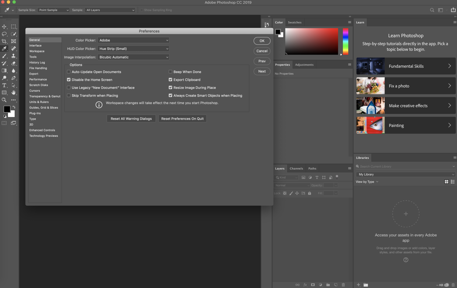
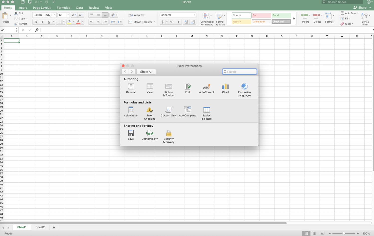
Left - Adobe Photoshop 2019 - This is the default preferences pane and application layout. To Adobe’s credit, they are featuring additional learning resources directly in the application. Right - Microsoft Excel 2018 - This is the default preferences pane and application layout. As a user, if I don’t know what I am trying to accomplish, how do I figure it out?
Good Design
Good design is like a cold drink on a hot afternoon - it is great because of how it makes you feel. Examples of good design include instances where utility is lower than what is possible but accessibility is high as well as where utility is very high and accessibility is moderate but better than competing solutions.
Sub-Optimal Utility, High Accessibility
Amazon’s Alexa / Echo products captured a significant share of the voice activate speaker market due to their immediate accessibility. After initial setup, anyone could use the product because Alexa / Echo meet the user on the user’s terms. Alexa / Echo don’t require the user to read the manual, allocate additional resources to use the product, require the user to remember what they said previously, or dig into product documentation unless the user wants to dig deeper of their own accord. Alexa / Echo’s generalist design is likely at the expense of maximizing specific utility for consumers were it to focus on specific verticals or industries or customer types. This was the correct design choice however as it allowed Amazon to gain maximum market share which in turn improved the Alexa / Echo product via training data.
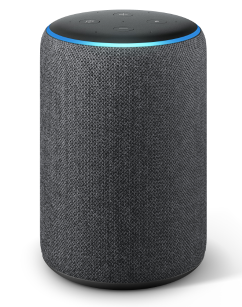
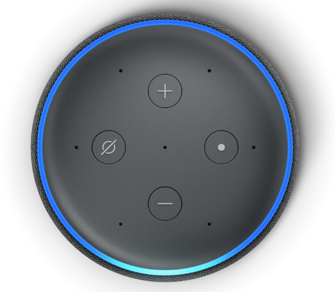
Left - Amazon Echo Right - Amazon Echo Dot
High Utility, Moderate Accessibility
Salesforce CRM and its associated suite of applications have high amounts of Utility, but their good design lay in the fact that they were hosted in the cloud compared to most of their on premise competitors. While the UI/UX of Salesforce is mediocre at best, Salesforce focused on the design attribute that mattered most: widespread “literal” accessibility and a consumer-like configurability. Previously, CRM systems were costly to deploy, use, configure and update. Salesforce focused on reducing the costs of those four attributes while assuming that the Utility provided would make up for moderately better accessibility. This assumption has largely proven correct as Salesforce has continued to grow and take market share from significant competitors (Microsoft, Oracle).