Product Elements as Moving Targets
Product Background
- You have likely first encountered “moving target product elements” at online retailers as the practice of exit intent pop-ups has become more common.
- This practice started several years ago as savvy e-commerce software providers realized that they could measure mouse movement to predict when a customer is about to leave a given e-commerce site, and serve that consumer with a pop-up with a discount code as a last ditch method of getting the consumer to click the buy button.
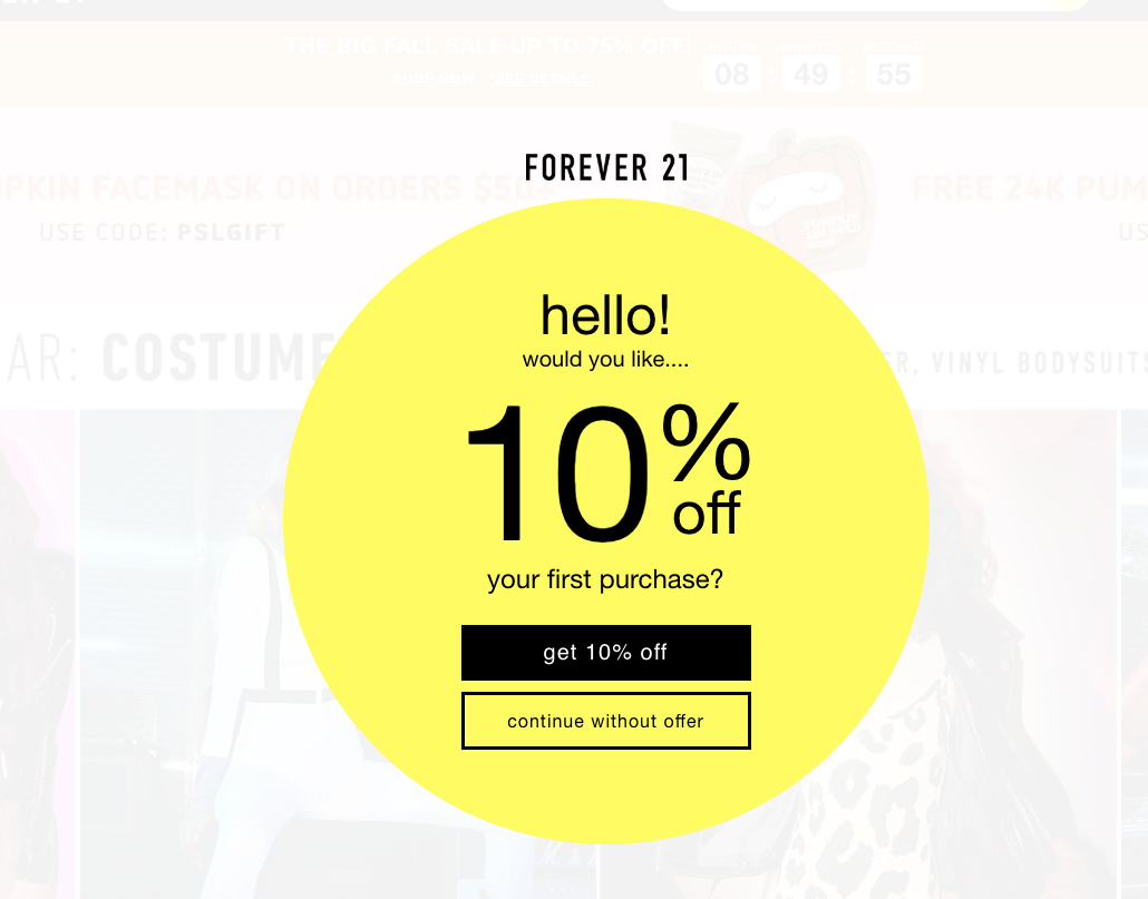
- Two examples from Uniqlo and Forever 21. Both Uniqlo and Forever 21 are on the more aggressive end of the spectrum as they take over the entire browser window.
- The side issue here is that, just as with coupon codes, retailers are now training consumers that they just need to attempt to navigate away from the page to get a retention offer. The slippery slope of e-commerce retargeting is another post entirely.

- Unfortunately, an analogous problem has started to crop up in the design of products that incorporate browser/UI elements where the content is dynamic / can be dynamically altered with the combination of algorithmic / machine learning suggestions.
- This issue can be particular obvious to the user if their connection/device is slow in receiving/processing additional updates.
UX Issue
Let’s walk through two particularly egregious examples:
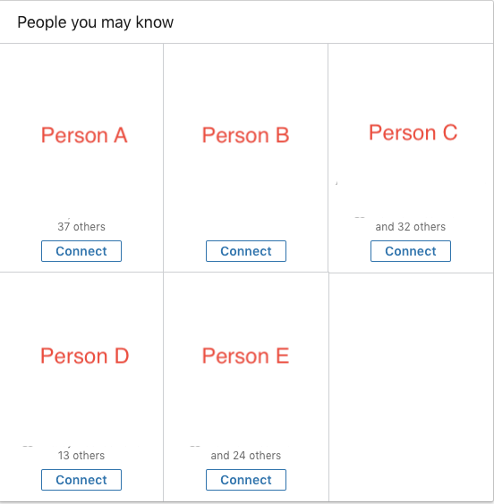
- LinkedIn - People You May Know
- LinkedIn has a feature called People You May Know, which you can find at linkedin.com/mynetwork/ or by clicking on the My Network tab at the top of the screen.
- The issue here is that if the user clicks connect on Person C, every person element after that will switch positions. For example, if I click Connect on Person C, Person D will move to Person C’s location, while Person E will move to Person D’s prior location.
- This is problematic for two reasons:
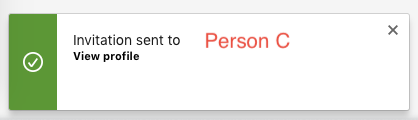
- First - As a user, I’d prefer a longer indication that my click on Connect actually did something aside from a popup notification in the lower left corner that disappears after several seconds.
- Second - If I so desired to connect right after that with Person E, it requires me to remember their photo or their name, instead of just the position of the tile on the page.
- This is particularly acute in this situation because Person E may be someone I just met or might easily forget the name of, and given that the goal of this tool is to connect me to people that I might know, the design is totally opposed to the actual goal of the product.
- In addition, this example is constrained to 5 people for simplicity. On the actual website, a user might be presented with several dozen individuals at a time due to the dynamic addition of tiles as the user scrolls down, adding to the already cognitive burden of the feature.
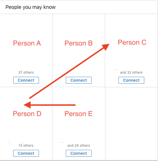
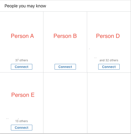
Left - People You May Know (PYMK) Upon Page Load Middle - PYMK Tiles Movement Upon Clicking Person C Right - PYMK Tiles After Clicking Person C
- Android - Content Sharing ChooserUpdate 11/9/2018Apparently I’m not the only one - on 11/9/2018, Dave Burke, the VP of Engineering on Android says a fix is in the works! Hopefully they work on the moving target issue.Tweet LinkOriginal Content BelowThis example is based on Android Pie Version 9 October 5th, 2018 Update on a Pixel 2. As Google incorporates additional AI/ML into their various pieces of technology, one of the primary objectives is to surface the most relevant content to the user at the most relevant moment. While this is an admirable goal, it can also create interface situations where the user needs to possess an exceptional memory to achieve their objective. The image on the left is the Android Chooser, Android’s standard interface for sharing a piece of content throughout the operating system. It is also what appears the 1st time that I click to share the current site I am currently visiting in Chrome. Side Note - Having a system wide chooser is actually a fantastic UX choice as it minimizes the chance that each individual application will hijack the sharing experience for very little UX gain. The image on the right is the same Android Chooser, except it is the Chooser that appears 5 seconds later when I tapped “Share” one more time. I promise this isn’t a spot the differences game, so let’s run through what has changed:You’ll notice that there are over 11 element shifts, where the position of elements has changed.You’ll also notice that there is one element addition (Save to Drive) and one element subtraction (Yelp Friends).In both scenarios, the top row of icons only appears after several seconds of the bottom 3 rows being visible, which is another moving element to add to the list. The significant movement of elements in this example eliminates any chance the user might have of memorizing the physical positioning of the option they want to select. It requires the user to review each option, in full, each time this screen is generated.To put this in perspective, imagine if the same scenario occurred for your smartphone homescreen and ~75% of the app icon locations were randomized each time. If that sounds like a nightmare from a UX standpoint, why is it acceptable here?
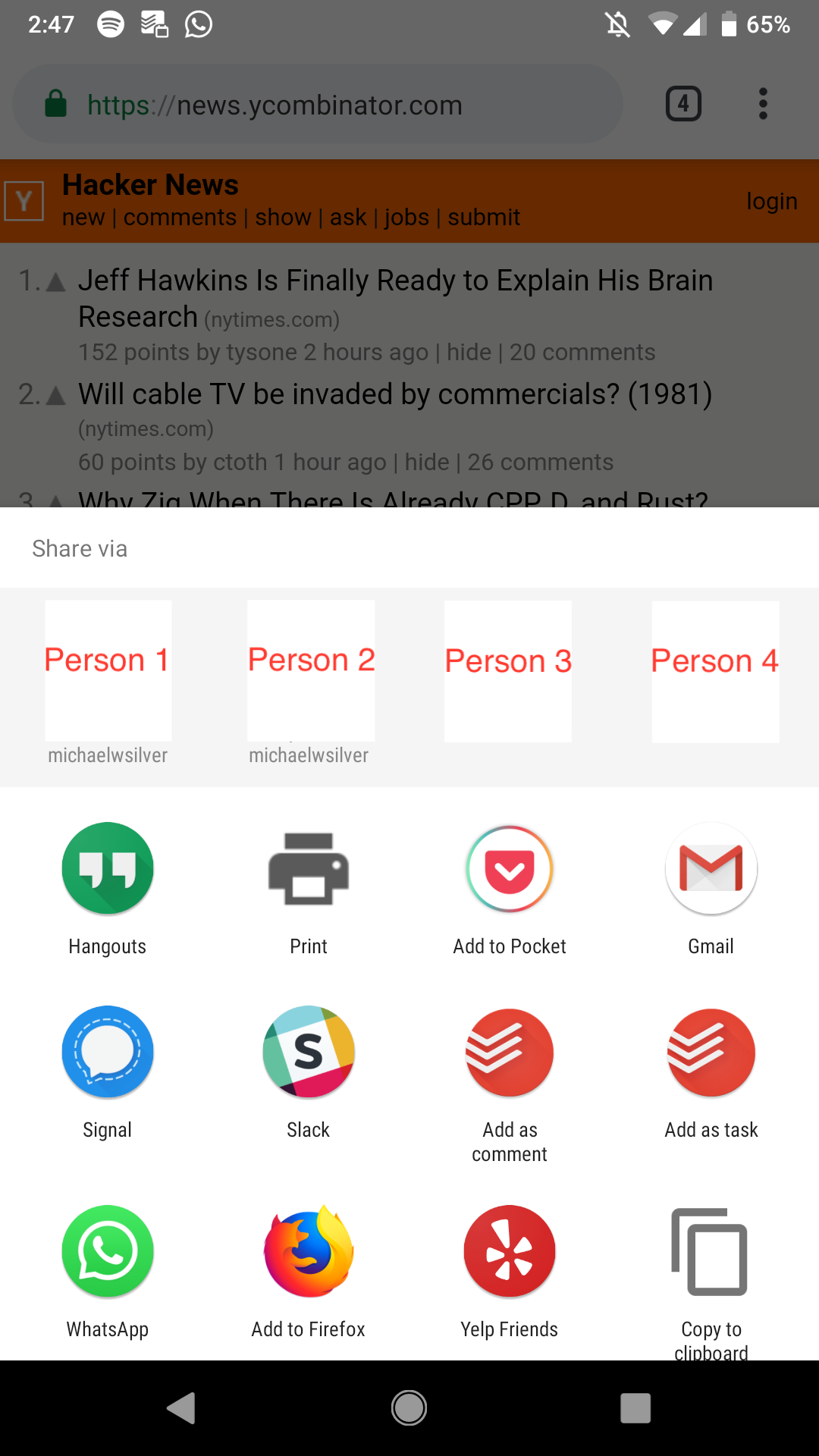
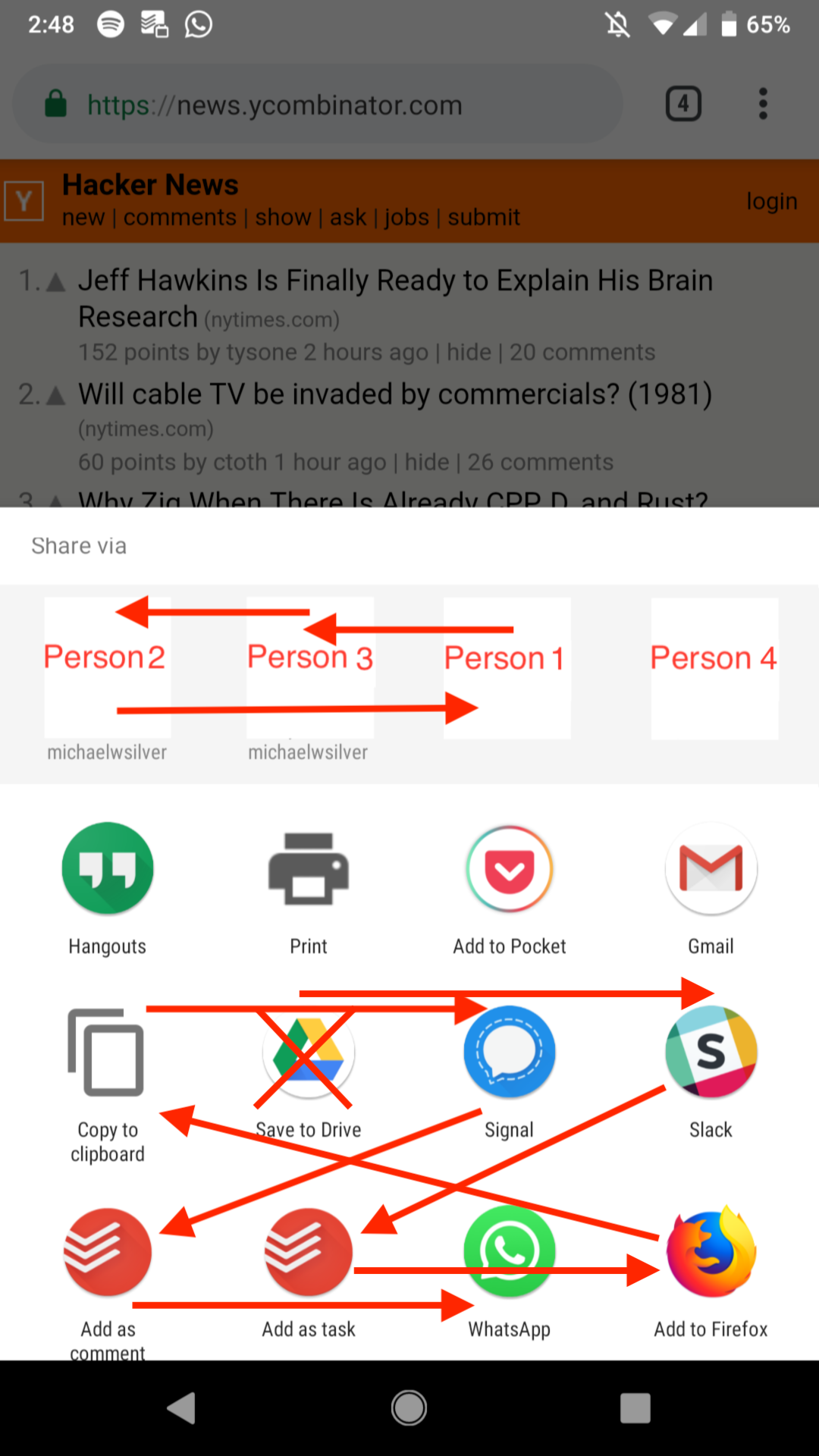
Left - Android Chooser - Time (T) = 0, 1st Open Right - Chooser - T+5 Seconds, 2nd Open, 11 Elements Shifted out of 16
Potential Remedy
- The potential remedy here is simple - don’t have dynamically refreshed and moving elements that require significant cognitive effort on the part of the user.
- This can get more complicated and interesting when AI/ML are involved and can conceivably make recommendations that they believe to be more relevant than the current set.
- The balance of recommending the best option to the user versus the most consistent option to the user should at least be considered, as it might provide a better UX overall.
- In general, dynamically moving elements without a page refresh, or without some notification to the user that the content should change, are very difficult to pull off because they require the user to remember too much about the application state.